A friend of mine posted this on facebook the other day and while I'm not usually one to post videos, I can't resist this one.
Watch this little girl give a funeral for her goldfish Lucky.
Watch the whole thing.
Monday, March 30, 2009
Sunday, March 29, 2009
The most amazing news
I just have to share some wonderful news that I got on Friday.
My lovely Mike and I have been planning a trip to Seattle in May for a few months now. Plane tickets (Winnipeg to Vancouver) and train tickets (Vancouver to Seattle) have been purchased, as well as hotel rooms and Mariners vs. Red Sox tickets.
However, we only just had an amazing discovery on Friday.
While we're in Seattle, the most amazing thing is also occurring a mere 2.5 hours away.
Yes, Sasquatch! Music Festival is happening while we're there! I've wanted to go to the annual festival ever since I first heard of it three or four years ago. What amazing luck! What a beautiful coincidence! What great timing!
The line-up is amazing. Mike's less enthusiastic, there's none of his beloved classic rock on schedule (he doesn't quite share my love of indie music), so I'm trying to convince him that renting a car and driving down to the Gorge for a day would be worth it.
 (The mainstage at Sasquatch. Such an amazing view! There's many other stages, as well as camping.)
The shows run Saturday to Monday, and our flight to Winnipeg leaves first thing Sunday morning, so we'd only get to see Saturday's shows (which is the best line up anyways, in my opinion).
Here's the line up (I bolded the bands that I really really like):
Saturday, May 23rd
Sunday, May 24th
Isn't this amazing? We can't NOT go.
My lovely Mike and I have been planning a trip to Seattle in May for a few months now. Plane tickets (Winnipeg to Vancouver) and train tickets (Vancouver to Seattle) have been purchased, as well as hotel rooms and Mariners vs. Red Sox tickets.
However, we only just had an amazing discovery on Friday.
While we're in Seattle, the most amazing thing is also occurring a mere 2.5 hours away.
Yes, Sasquatch! Music Festival is happening while we're there! I've wanted to go to the annual festival ever since I first heard of it three or four years ago. What amazing luck! What a beautiful coincidence! What great timing!
The line-up is amazing. Mike's less enthusiastic, there's none of his beloved classic rock on schedule (he doesn't quite share my love of indie music), so I'm trying to convince him that renting a car and driving down to the Gorge for a day would be worth it.
(The mainstage at Sasquatch. Such an amazing view! There's many other stages, as well as camping.)The shows run Saturday to Monday, and our flight to Winnipeg leaves first thing Sunday morning, so we'd only get to see Saturday's shows (which is the best line up anyways, in my opinion).
Here's the line up (I bolded the bands that I really really like):
Saturday, May 23rd
Kings of Leon / Yeah Yeah Yeahs / The Decemberists / Animal Collective / Bon Iver / Devotchka / M. Ward / Doves / Sun Kil Moon / The Gaslight Anthem / King Khan & The Shrines / Ra Ra Riot / Shearwater / Passion Pit / Mt. St. Helens Vietnam Band / Vince Mira / Blind Pilot / AA Bondy / Owl City / Arthur & Yu / Dent May & His Magnificent Ukulele / Death Vessel / People's Republic of Komedy / James Pants / Todd Barry / Tim and Eric / Crystal Castles / Nick Thune / Mos Def / Maria Bamford / Champagne Champagne
Sunday, May 24th
Jane's Addiction / Nine Inch Nails / TV On The Radio / The Murder City Devils / of Montreal / The Avett Brothers / Calexico / M83 / The Airborne Toxic Event / The Walkmen / The Wrens / St. Vincent / The Dodos / John Vanderslice / The Submarines / Viva Voce / The Builders And The Butchers / Fences / Point Juncture, WA / The Red Wine Boys / Hockey / Zach Galifianakis / Deadmau5 / Natalie Portman's Shaved Head / People's Republic of Komedy / Aziz Ansari / Japandroids / Mike Watt and The Missingmen / Mad Rad / Street Sweeper
Monday, May 25thBen Harper and Relentless7 / Erykah Badu / Silversun Pickups / Fleet Foxes / Gogol Bordello / Santigold / Grizzly Bear / Explosions In The Sky / Girl Talk / Blitzen Trapper / The Knux / Monotonix / Bishop Allen / Black Moth Super Rainbow / Beach House / Mugison / The Dutchess And The Duke / School Of Seven Bells / Horse Feathers / The Pica Beats / Loch Lomond / Heartless Bastards / The Whitest Kids U' Know / People's Republic of Komedy / Tobacco / Chromeo / God's Pottery / Demetri Martin / BLK JKS / Other Lives
Isn't this amazing? We can't NOT go.
The best ideas are the simplest.
Since I work in advertising as a graphic designer, I'm always on the look out for trends in advertising.
I've seen a few examples lately of ads that are such simple ideas but that work so incredibly well at engaging the public. These two are projects without a huge budget, without TV spots or websites (I have to admit, I found them both on thecoolhunter). The concept is that imagery is placed large-scale on the floor, leaving interesting optical illusions.

This January 2009 ad is for a Skydiving company in Switzerland. The floor of an elevator is pasted with a sticker of an aerial view of their city. Their ad agency is a company called Wirz/BBDO Switzerland. So such a simple yet amazing concept! I love it (though I'd probably get dizzy in that elevator....).

I love this piece! Ad agency superstars Saatchi & Saatchi created this amazing ad in Jakarta, Indonesia, for pet emporium Jakpetz. As people walk through the shopping centre, the people become the fleas on the dog. I love how it isn't immediately noticed until you see it from the balconies above. Brilliant!
I've seen a few examples lately of ads that are such simple ideas but that work so incredibly well at engaging the public. These two are projects without a huge budget, without TV spots or websites (I have to admit, I found them both on thecoolhunter). The concept is that imagery is placed large-scale on the floor, leaving interesting optical illusions.
This January 2009 ad is for a Skydiving company in Switzerland. The floor of an elevator is pasted with a sticker of an aerial view of their city. Their ad agency is a company called Wirz/BBDO Switzerland. So such a simple yet amazing concept! I love it (though I'd probably get dizzy in that elevator....).
I love this piece! Ad agency superstars Saatchi & Saatchi created this amazing ad in Jakarta, Indonesia, for pet emporium Jakpetz. As people walk through the shopping centre, the people become the fleas on the dog. I love how it isn't immediately noticed until you see it from the balconies above. Brilliant!
Wednesday, March 25, 2009
Movies and Afghans
I saw this trailer today! It looks incredible! That may have to do with the fact that they use Arcade Fire.... how can you go wrong? I'm not one to enjoy fantasy/childrens movies, but I think I might have to make an exception for this one.
And here's another trailer I just had to post. The King and I (from 1956, starring Deborah Kerr and Yul Brynner was my favorite movie from about age 5 to age 10. I think I watched the entire 2+ hour long musical at at least 3 of my birthday parties (I'm surprised any of my friends came after the first time). It's such a charming movie! Anyways, the trailer is absolutely hilarious. They sure have changed in the past 50 years.
In some very good news, I finished my afghan last night! After about $110 of Vanna White yarn and 110 hours of crocheting, it's finally done. It only took me two months to finish (my last one was starting 5 years ago and still not complete...).

I don't have a camera to take nice pictures of it, so I just took a few with my iMac. You can't really see any detail or how big it is (queen size).

When I was a kid my parents had two big afghans in our family room. I liked to hang them across furniture and make forts, and I'd poke at the light coming in through the holes.

Sunday, March 22, 2009
9 days until a new home, 54 days until Seattle, 84 days until Coldplay
A friend of mine posted this on facebook the other day and I just had to share.
This awesome product is called walls notebook.

Its' pages are full of pictures of New York City buildings, walls, vehicles, and more.

The concept is that you can draw on these buildings all you want without getting in trouble with the law for graffiti.

Quite brilliant, I think. I'd like to see one of Winnipeg streetscapes and buildings.
These products are made by a company called the. in the States.
This awesome product is called walls notebook.
Its' pages are full of pictures of New York City buildings, walls, vehicles, and more.
The concept is that you can draw on these buildings all you want without getting in trouble with the law for graffiti.
Quite brilliant, I think. I'd like to see one of Winnipeg streetscapes and buildings.
These products are made by a company called the. in the States.
Friday, March 13, 2009
293
So here I am, doing my Pyrex blog. I'm probably the hugest dork ever for blogging about Pyrex.
Before I get started on lovely pictures and such, here's a few facts about Pyrex. Pyrex was introduced by American company Corning Incorporated in 1915. It was originally made from thermal shock resistant borosilicate glass, but now it's made of tempered soda lime glass in Charleroi Pennsylvania. Because of it's low expansion properties, it's often used for reflective optics in astronomy applications, mainly telescopes.
While Pyrex products are now mainly all clear glass, they used to be really bold and colorful, with great graphic patterns.
Here are a few of my favorites. I got most of these images and information from a site called Pyrex Love. It's a great resource.

Of course, I have to start with this series called Woodland. My mother had the bowls on the left, as well as the lighter brown mixing bowl (which is now mine), so while these aren't really the most beautiful Pyrex pieces, they hold a sentimental value to me. The Woodland series came out in 1978.

I really really love this series. It's called Friendship and all pieces are so colorful, they make me want to cook something wonderful with them. They're distinctive mainly by red and orange leaf/chicken patterns on white, with bright red accent bowls. They first came out in 1971.

I love this piece! It's a special promotional piece. The pattern isn't known, but it's sometimes referred to as "Weave" by Pyrex fanatics. I love the solid casserole dish and the pattern on the lid is very cool, almost Escher-esque.

This beautiful baking dish is part of the Solid Colors family. The year it came out isn't listen, but it's 8 by 8 inches. I love the robin egg blue color! So cheery. It sells for about $15 on ebay.

I love these bowls! They're part of the Terra family, and these mixing bowls came out in 1964.

Look how sweet this butter dish is! I am on the lookout for a good butter dish and if I can find this one on ebay, I'll be thrilled. I love the farmer and wife details. The pattern is called Butterprint, but is often also referred to as "Amish". This piece came out in the 1960s.

This piece is a cake dish in the Desert Dawn series. The slight speckles are what characterize this dish, and it also came out in yellow. It was released in the late 1950s or early 1960s. It makes me want to bake a cherry chip cake in it.

These hard-to-find pieces are the promotional Balloons chip and dip set. I love the hot air balloon graphics! They came out in 1958 and are a very sought-after piece, running at around $90 on ebay.

I love this children's mug! It's a special promotional piece, date unknown (though probably the mid 1950s). Aren't the little train cars super cute?

This is another specialty piece. It's very rare and not a lot is known about it. It's a difficult one to find. I love the cross-stitch pattern!

Black Pyrex is something people don't usually see. As far as I can tell, the Snowflake series is the only one using black as the main color. This divided dish came out in 1957 and comes with a clear glass top.

These Red, Opal White, and Yellow ramekins are so cheery and colorful. However, these weren't particularly popular. Apparently the edges were a bit sharp and so it was difficult to get food out.

Here's a group shot of a bunch of "Refrigerator Sets". I'm trying to use less and less plastic, and this is a great way to reduce the amount of tupperware in the house and go more enviromentally friendly. Plus, they're super cute and will definitely last a lot longer than cheap plastic.

I'm sure you've all had enough of Pyrex by now (if you've even made it this far), so I'll leave you with one last piece. This 1972 casserole dish is from the Seville promotional pieces. I love love love the orange and pink color scheme, and the graphic on top is full of detail and embellishments. So gorgeous.
Sunday, March 8, 2009
Stair Porn - sfw
I absolutely love stairs, ever since I was a kid. There's something that speaks of elegance in a well-designed staircase. I also may or may not have had this dream of walking down a huge ornate staircase in a fancy dress, a la Belle in Beauty and the Beast...
I came across a really cool blog about stairs the other day, called stair porn. The only downside of stair porn is that the majority of them have no explanation or mention of the designer or the background.
Here's a few of my favorite stairs from stair porn.

Of course, I have to start with this awesome stair "signage" by Paula Scherr. I work as a graphic designer in a creative building called Art Space, and one of my latest projects is to create new signage at each floor landing. I'm trying to pitch this as a concept for the project. Hopefully it'll fly.
 A unique "cut-out" solution to a railing in Mondrian South Beach.
 "Reverse" stairs by Michael Wilford, an architect from East Sussex.
 Art deco stairs in a family residence in Brussels.
 While the style of this one is a bit gaudy for my taste, I love how it twists within itself!
 A unique self-contained spiral staircase in Almere, Netherlands.
 I love how practical this is! Making beautiful use of an otherwise wasted space.
 Once again, making use of space. Though I have a feeling I'd rather want to sit in the sun and read there, than walk on those stairs. I believe it's from a Flat in Vigo.
 The minimalist in me LOVES this. Though if I were walking on it, I'd probably be grasping for something to hold on to as I got to the top, haha.
And last but not least is one of my all-time favorite staircases. Or rather series of staircases.
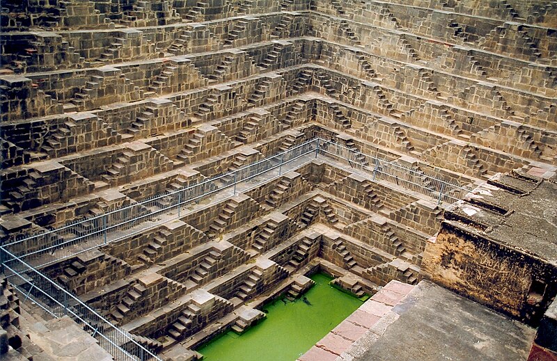
 This is called Chand Baori, a series of stairs leading to a well in a village called Abhaneri in India. It was built in the 9th century, is 13 stories high, 100 feet deep, and has 3500 stairs. According to local legend, it was built by ghosts in one night. This is so remarkable, I love it!
I came across a really cool blog about stairs the other day, called stair porn. The only downside of stair porn is that the majority of them have no explanation or mention of the designer or the background.
Here's a few of my favorite stairs from stair porn.
Of course, I have to start with this awesome stair "signage" by Paula Scherr. I work as a graphic designer in a creative building called Art Space, and one of my latest projects is to create new signage at each floor landing. I'm trying to pitch this as a concept for the project. Hopefully it'll fly.
Art deco stairs in a family residence in Brussels.While the style of this one is a bit gaudy for my taste, I love how it twists within itself!A unique self-contained spiral staircase in Almere, Netherlands.I love how practical this is! Making beautiful use of an otherwise wasted space.Once again, making use of space. Though I have a feeling I'd rather want to sit in the sun and read there, than walk on those stairs. I believe it's from a Flat in Vigo.The minimalist in me LOVES this. Though if I were walking on it, I'd probably be grasping for something to hold on to as I got to the top, haha.And last but not least is one of my all-time favorite staircases. Or rather series of staircases.
This is called Chand Baori, a series of stairs leading to a well in a village called Abhaneri in India. It was built in the 9th century, is 13 stories high, 100 feet deep, and has 3500 stairs. According to local legend, it was built by ghosts in one night. This is so remarkable, I love it!Vintage Posters
I was at St. Vital mall today with Mike and it turns out there was an antique show at the mall!
There was a lot of crap, but a lot of cool random things. I'm generally too impatient to pick through antiques too much, but one thing stood out to me (though I didn't get it).
A vintage pyrex mixing bowl from 1967!

Pyrex came out with some very cool designs with great graphics. I think I'll write a post about pyrex in the near future.
Anyways, on to what I bought. There was a booth selling old magazine ads. I found three that I figured would be cool to put in my kitchen or bathroom, in bright colorful red or yellow frames.

Here's all three, plus my toes.

The largest, probably 17 by 11 or so, it's for Eatons, from Weekend Magazine, 1963. All of these are not actually wrinkled, that's just the plastic sheet they're in.

I'm not entirely sure what this one is for. Some product called Bon Ami, I think it's some sort of powder cleaning detergent. I love the colors in the image on the left side of the ad. The copyright above the logo says it's from 1937.

Ogilvie Minute Oats ad from MacLeans magazine, November 1, 1944. This piece is advertising getting a free war-esque paper figure with a stand when you buy their oats. There are soldiers, sailors, airmen, airwomen, WRENs (not sure what that is) and CWACs.
Subscribe to:
Posts (Atom)