Showing posts with label Inspiration. Show all posts

Thursday, October 1, 2009

Lazy Dancer


I've never really listened to Metric. They're one of those bands that I know is good, but I've never bothered to get into them.

Until the past two days. Their new album Fantasies is all I've been listening to at work. The song above is my favorite song from the album, called Collect Call. It's wonderful.


I also forgot to post a picture. My nephew Benjamin is almost two and a half, and comes over to my apartment every few weeks to go swimming in my building's pool. The last time he was over he did something for the very first time!

So what was this amazing feat?


He drew on my wall. Yes, for the very first time, Ben scribbled on a wall. I think it's cute though, and I don't want to remove it. So sweet.

Monday, August 31, 2009

Pretty Neon Colors

I have a couple more pictures from fashionation to share.

These pictures are by photographer Paco Peregrin from Spain.


Paco originally studied drawing, painting, and communication before turning to photography and I love how he uses his traditional art skills in his photos!


I wish I could have hair and makeup like this everyday.

Wednesday, August 26, 2009

I can't help it, they're my favorite...

Coldplay has a new music video for their latest single Strawberry Swing. I'm not usually one to share music videos, but this one is really cute!

It features stop motion animation of a man (Chris maybe? You can never see his face) going through a sweet imaginary chalk drawing dream sequence.


Here's a screenshot.

The video isn't on youtube yet, but you can view it here on Coldplay's website.

Saturday, June 20, 2009

Coldplay!

Ahhh! My favorite band to see live ever.

I saw them in November in Minneapolis after hearing that they'd canceled their Winnipeg show last year and nearly died. I've never been so blown away by a concert.

So, when they announced they were coming to Winnipeg in June, I bought floor tickets as soon as the pre-sale started.


Here's a video from the show. The first time I saw them live, I didn't like this remix of the song, but now I love it! Notice at 3:14, Will and Guy look like their talking with their eyes and Will does this funny little smile. It makes me feel like I'm in their secret conversation.


Here's a few of my favorite shots from the evening.

Punch-kick-kaboosh!


Crowd on the screen during Fix You. Look how happy everyone is!

Viva la Vida. I die every time Will Champion hits that bell.

Chris with a japanese umbrella in the butterfly confetti during Lovers in Japan. I love how the crowd is all looking up at the confetti.


All true performers bow at the end of their show. What gentlemen.


Sigh. I'm in love.

Thursday, June 11, 2009

Two things I found on Jen Loves Kev

I found two of the most gorgeous things on Jen Loves Kev while poring over dozens of pages of her blog.

The first is two necklaces by Figs & Ginger. Figs & Ginger is a husband/wife team who make eco-friendly sterling silver jewelry.

This fawn necklace is so sweet. I want it. And it's only $40! I'm very tempted to order it.


Lovebirds necklace, also $40. All jewelry is made from at least 50% recycled metal and all are made by hand. So sweet.


The next thing I found was the most beautiful prints by Bryan Nash Gill, an artist from Connecticut. (descriptions taken from Ashes & Milk)


Through relief printing and a laborious rubbing technique Byran created the above piece Hemlock 82 (Bryan literally scratched his fingernails over every surface of the tree). At the grand size of 5 long x 38.5″wide the actual diameter, texture and pattern of this tree section is gorgeously translated onto paper.


Ink is rolled out and a piece of handcrafted washi paper is placed over the print block. Pressing little by little with his fingertips, Bryan imprints the texture of the wood on the surface of the paper.

If you want a print of this tree though, they don't come cheap. Prints cost a mere $4000. Yes, four thousand. But aren't they beautiful?

Ah! Exciting!

I was reading Design Sponge this evening and from there I just stumbled upon the most fantastic blog! I'm always loving some good food/fashion/design, and Jen Loves Kev is perfect for me!

I'll share a bit of a post here to entice you a bit...

(image from Design Sponge) I LOVE the wall treatment... I seriously want to do it in my living room. I have this incredibly long concrete wall that I can't put pictures on, but this would be perfect! I love greys. And the little yellow heart on the pillow? Amazing.


Also this very sweet song. I need to re-learn french. I've forgotten so much in the past 5 years.

Sunday, June 7, 2009

The Genius That is Frank Gehry

While I was in Seattle last month, I got my first experience of Frank Gehry's architecture in person. Excuse my excitement as I post a lot of pictures.

Gehry, a Canadian-born architect now living in LA, studied at Los Angeles City College, University of Southern California's School of Architecture, and topped off his education by dropping out of Harvard's City Planning program.


I'm a huge architecture nerd, so I was so excited to visit the Experience Music Project. The building was completed in 2000 and is home to many exhibitions about Seattle's music scene, as well as music from all over the world.


As soon as the EMP was in sight as we walked there from our hotel, I couldn't contain my excitement. This building did not disappoint!


It's truly a work of art, combining organic shapes with metallic and glossy materials in baby blue, copper, red and pinks.


It's curves were so gorgeous, and I love how the public transit train runs right through the building.


In one end....


... and out the other.


(Is this a sphynx? Intentional or not?)


The interior of the building is nearly as impressive. It's a seemingly endless interior of curves, halls, metals, and shapes, all accented with bright colors.


The tourist picture, complete with the Space Needle in the EMP's reflection. I look cool and collected here, but I was dying on the inside.

I think I spent more time gawking at the architecture than I did at the exhibits inside the museum (a common criticism of Gehry's work).


The EMP is just one of Gehry's works, though one of his more famous.


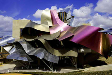
Among his other notable pieces is Hotel Marqués De Riscal in Alava, Spain.


The hotel is built into the Spanish country, and is almost like a ribbon on the side of a hill.


Another notable piece is the Disney Concert Hall in LA, completed in 2003.


Another Gehry building I hope to visit one day is the Weisman Art Museum at the University of Minnesota in Minneapolis.


Monday, April 13, 2009

You must watch this

A truly unexpected performance. Watch the whole thing.


Just goes to show that you never know what you might get.

Sunday, March 29, 2009

The best ideas are the simplest.

Since I work in advertising as a graphic designer, I'm always on the look out for trends in advertising.

I've seen a few examples lately of ads that are such simple ideas but that work so incredibly well at engaging the public. These two are projects without a huge budget, without TV spots or websites (I have to admit, I found them both on thecoolhunter). The concept is that imagery is placed large-scale on the floor, leaving interesting optical illusions.


This January 2009 ad is for a Skydiving company in Switzerland. The floor of an elevator is pasted with a sticker of an aerial view of their city. Their ad agency is a company called Wirz/BBDO Switzerland. So such a simple yet amazing concept! I love it (though I'd probably get dizzy in that elevator....).


I love this piece! Ad agency superstars Saatchi & Saatchi created this amazing ad in Jakarta, Indonesia, for pet emporium Jakpetz. As people walk through the shopping centre, the people become the fleas on the dog. I love how it isn't immediately noticed until you see it from the balconies above. Brilliant!

Wednesday, March 25, 2009

Movies and Afghans

I saw this trailer today! It looks incredible! That may have to do with the fact that they use Arcade Fire.... how can you go wrong? I'm not one to enjoy fantasy/childrens movies, but I think I might have to make an exception for this one.


And here's another trailer I just had to post. The King and I (from 1956, starring Deborah Kerr and Yul Brynner was my favorite movie from about age 5 to age 10. I think I watched the entire 2+ hour long musical at at least 3 of my birthday parties (I'm surprised any of my friends came after the first time). It's such a charming movie! Anyways, the trailer is absolutely hilarious. They sure have changed in the past 50 years.


In some very good news, I finished my afghan last night! After about $110 of Vanna White yarn and 110 hours of crocheting, it's finally done. It only took me two months to finish (my last one was starting 5 years ago and still not complete...).


I don't have a camera to take nice pictures of it, so I just took a few with my iMac. You can't really see any detail or how big it is (queen size).


When I was a kid my parents had two big afghans in our family room. I liked to hang them across furniture and make forts, and I'd poke at the light coming in through the holes.


Sunday, March 22, 2009

9 days until a new home, 54 days until Seattle, 84 days until Coldplay

A friend of mine posted this on facebook the other day and I just had to share.

This awesome product is called walls notebook.


Its' pages are full of pictures of New York City buildings, walls, vehicles, and more.


The concept is that you can draw on these buildings all you want without getting in trouble with the law for graffiti.


Quite brilliant, I think. I'd like to see one of Winnipeg streetscapes and buildings.


These products are made by a company called the. in the States.

Friday, March 13, 2009

293

So here I am, doing my Pyrex blog. I'm probably the hugest dork ever for blogging about Pyrex.

Before I get started on lovely pictures and such, here's a few facts about Pyrex. Pyrex was introduced by American company Corning Incorporated in 1915. It was originally made from thermal shock resistant borosilicate glass, but now it's made of tempered soda lime glass in Charleroi Pennsylvania. Because of it's low expansion properties, it's often used for reflective optics in astronomy applications, mainly telescopes.

While Pyrex products are now mainly all clear glass, they used to be really bold and colorful, with great graphic patterns.

Here are a few of my favorites. I got most of these images and information from a site called Pyrex Love. It's a great resource.


Of course, I have to start with this series called Woodland. My mother had the bowls on the left, as well as the lighter brown mixing bowl (which is now mine), so while these aren't really the most beautiful Pyrex pieces, they hold a sentimental value to me. The Woodland series came out in 1978.


I really really love this series. It's called Friendship and all pieces are so colorful, they make me want to cook something wonderful with them. They're distinctive mainly by red and orange leaf/chicken patterns on white, with bright red accent bowls. They first came out in 1971.


I love this piece! It's a special promotional piece. The pattern isn't known, but it's sometimes referred to as "Weave" by Pyrex fanatics. I love the solid casserole dish and the pattern on the lid is very cool, almost Escher-esque.


This beautiful baking dish is part of the Solid Colors family. The year it came out isn't listen, but it's 8 by 8 inches. I love the robin egg blue color! So cheery. It sells for about $15 on ebay.


I love these bowls! They're part of the Terra family, and these mixing bowls came out in 1964.


Look how sweet this butter dish is! I am on the lookout for a good butter dish and if I can find this one on ebay, I'll be thrilled. I love the farmer and wife details. The pattern is called Butterprint, but is often also referred to as "Amish". This piece came out in the 1960s.


This piece is a cake dish in the Desert Dawn series. The slight speckles are what characterize this dish, and it also came out in yellow. It was released in the late 1950s or early 1960s. It makes me want to bake a cherry chip cake in it.


These hard-to-find pieces are the promotional Balloons chip and dip set. I love the hot air balloon graphics! They came out in 1958 and are a very sought-after piece, running at around $90 on ebay.


I love this children's mug! It's a special promotional piece, date unknown (though probably the mid 1950s). Aren't the little train cars super cute?


This is another specialty piece. It's very rare and not a lot is known about it. It's a difficult one to find. I love the cross-stitch pattern!


Black Pyrex is something people don't usually see. As far as I can tell, the Snowflake series is the only one using black as the main color. This divided dish came out in 1957 and comes with a clear glass top.


These Red, Opal White, and Yellow ramekins are so cheery and colorful. However, these weren't particularly popular. Apparently the edges were a bit sharp and so it was difficult to get food out.


Here's a group shot of a bunch of "Refrigerator Sets". I'm trying to use less and less plastic, and this is a great way to reduce the amount of tupperware in the house and go more enviromentally friendly. Plus, they're super cute and will definitely last a lot longer than cheap plastic.


I'm sure you've all had enough of Pyrex by now (if you've even made it this far), so I'll leave you with one last piece. This 1972 casserole dish is from the Seville promotional pieces. I love love love the orange and pink color scheme, and the graphic on top is full of detail and embellishments. So gorgeous.